Design
The Art of the Small Press Cover
On texture, restraint, and why a cover should leave space for imagination.
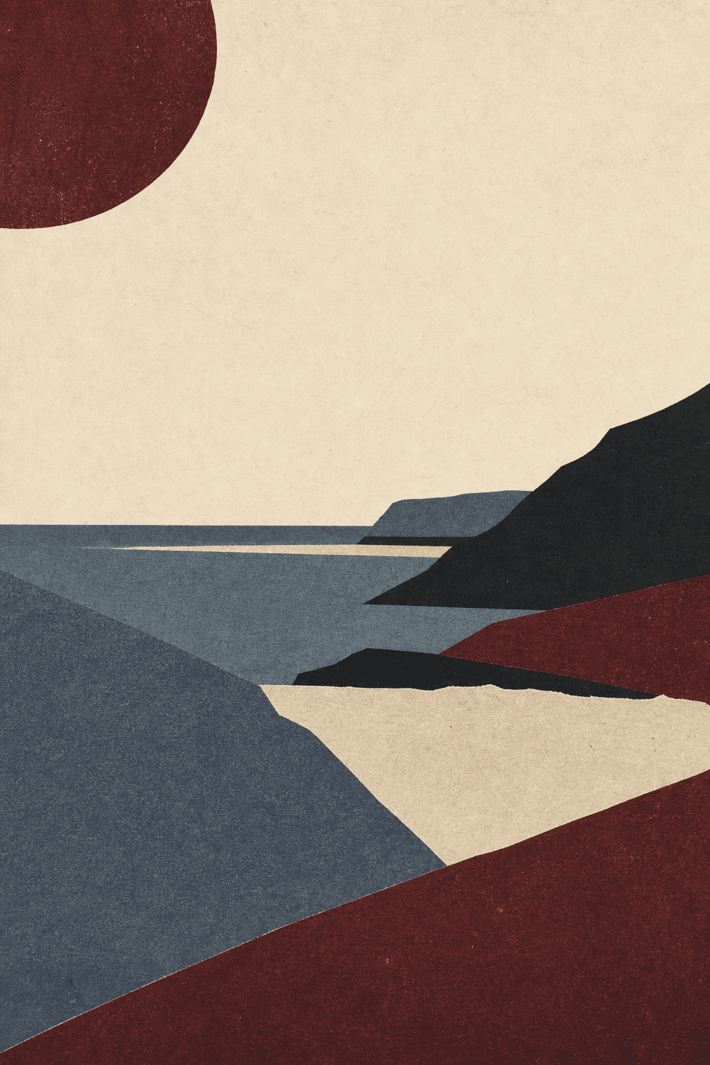
The Art of the Small Press Cover
A strong cover does not summarize a book. It establishes a climate. Color, type, image, and material arrive before the first sentence and make a quiet promise about the reading experience.
Small presses often excel because constraints sharpen the brief. Two inks, one sheet of uncoated stock, and a precise typographic idea can feel richer than a crowded photographic montage.
Restraint is not emptiness. It is confidence in the reader’s imagination.
A note to carry forward
Keep the thought close, but leave enough room for the next book to complicate it.